 Posted by
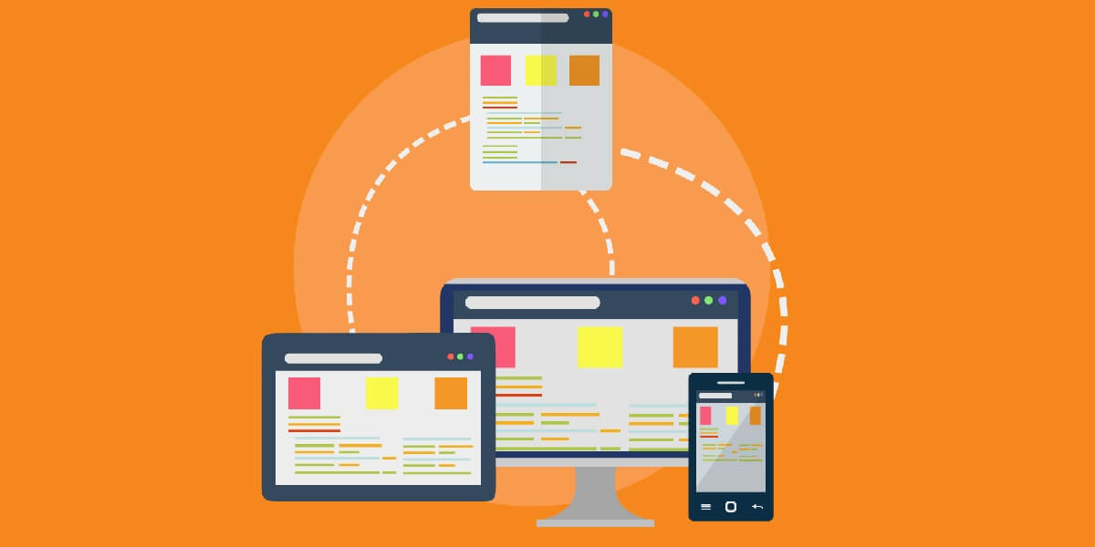
 So, finally, you have decided to venture into the creation of an amazing responsive website. Well done! With this decision, let’s say you have crossed half of the ocean, that is between you and your success. With the browsing landscape diversifying into mobile devices, netbooks, desktops, and so onward, responsive web designs. A responsive website allows the designers to provide different layouts for the specific device, and this gives the visitors great user-experience.
Today, Google has updated its ranking algorithm so much. Therefore, if you want your website to do something good, then you have to give your users an amazing user experience. And for this, you have to make the design your website to fit on the desktop screen as well as on the mobile screen and tablet screen.
So, you must have understood that- why designing a responsive website is essential. But here a question arises – how to do that? What tools to use to get this job done? Well, for a professional website designing company, it is their left-hand job. Since they have professionals and expert designers, who have complete knowledge about such techniques and tools.
However, if you want to learn that as well, keep on reading, because here in this blog you will find complete information about- how to make a responsive website.
As with the development of technology everyday designers, developers and other digital creators come with something new, so their audience craves for something new every day. Nowadays, the audience also becomes smart and they know what they want, and what digital marketers can provide them. However, if they don’t find what they are looking for then, they won’t stop on that website. And this can increase the bounce rate and will make a bad reputation over the internet.
Well, before knowing about the tools, you should know what factors you have to work on to make your website responsive completely. Well, we have divides those factors into four categories.
Let’s see what factors are these:
- Responsive typography
- Flexible images
- Responsive web page layouts
- Testing and cross-browser support
Now, further, we will move ahead to know about such tools that you can use to improve each factor.
Responsive Typography
First, let us look at the tools that can help in creating beautiful and adaptive typography.
1. Lettering.js
Lettering.js is a jQuery plugin, it is used for controlling the appearance of the web type. This is a great tool to help the designers to get a chokehold on their typography. Whether you are working to have a responsive website or not, having this tool can help you to control your web type and you can craft a truly creative look without restoring to image-based solutions.
In the context of having a responsive design, Lettering.js gives designers precise control over typography characteristics. With this you will get such characteristics- spacing, leading and kerning in order to produce an optimal reading experience in various spaces.
2. FitText
This is another jQuery plugin, it helps designers to make headlines responsive. FitText makes sure that your display text appears optimally on the various devices. This plugin is simple to use but its flexibility leaves the creativity in your hands and is easy to implement.
Flexible Images
After solving the typographic issue, now you should move to tackle the issue that comes with placing images. To make a website responsive, images play an important role, they should load fast, should be creative and more. And there is one great tool that you can include in your tool kit of the responsive website- imgSizer.js, read about it more below.
3. imgSizer.js
Remember, before you jump straight to the code of imgSizer, make sure that you collect the complete information about it and how and what role this tool can play to make a responsive website. Essentially, this script was designed to ensure that your images render cleanly in Microsoft Windows. This tool plays a good job in managing all the work related to the images on your website.
Responsive Web Page Layouts
The core of each website design is its layout, that adapts itself to the screen size and features of the user’s browser. Now let us move forward to know about the resources related to the layout, where most of the actions happen in responsive web designs.
4. Fluid 960 Grid System
If you’ve been utilizing the pervasive 960 Grid System by Nathan Smith (a lot of us have likely utilized it for projects or experimentation at some point in life), look at this fluid adjustment of the first venture. If you find this tool comfortable enough to use with the first 960.gs, at that point you realize how to utilize Fluid 960 Grid System.
5. Gridless
If a grid framework for web page formats appears to be excessively prohibitive to you, check out this coolest tool- Gridless. Gridless is meant to be leaner than other grid frameworks and was developed because of responsive plans. The Gridless code puts together its way of thinking concerning the much-talked mobile-first technique for creating sites that must be conveyed to a huge number of device environments.
For creators who are looking for to a greater extent a barebones, content-centered way to deal with responsive website architecture, you may get yourself comfortable with Gridless.
6. PXtoEM
It is a tedious mathematical process that is associated with converting fixed-width design work to a fluid layout. It helps in converting absolute units of the measurements, into relative units of measurement, such as ems and percent for typography, container, spacing, and widths, more.
PXtoEM is a tool that provides users with a simple conversion tool that helps them with math. The site will make you able to use the ability to quickly and easily change the base font size of their layout to something easier.
Testing and Cross-Browser Support
Finally, if you have reached this point after completing all the above, then you have successfully designed your responsive website. Now, you need to make sure that your site works in as many browsing environments as possible.
And for this, you can use the below-mentioned tools, let’s see.
7. Adobe Device Central
This tool is the best wat to test your website on different devices such as desktop, mobile and more. This is the one which helps in testing from within the devices themselves, nothing compares to seeing how your website actually looks on different screens. This also helps the designers to check how their website behaves within a particular mobile gadget or computer.
8. Web Developer
While some tools such as Device Central for testing the website is very expensive for some designers. Therefore, a fantastic alternative for this is- Web Developer browser extension. Available for Firefox and Chrome. This extention provides the designers with several other tools that come handy when you want to create a responsive website.
9. Respond.js
Respond.js is another testing tool that is a lightweight, open-source script and it gives more options for executing media-query-driven responsive web designs. The script is small- only 1KB when served gzipped to site users- and is unobtrusive. Therefore, there is a little excuse not to use it.
10. Modernizr
Modernizr is more like Respond.js, it is here to bring the designers the power of HTML5 and CSS3. This even works well in the older browsers. While it is not as lightweight as Respond.js, but it gives you media-query-like abilities in older browsers.
Another exciting thing about this is- the capability of the tool that brings designers, as it relates to responsive web design, is some added support for the very intriguing. However, currently problematic and tumultuous. It also provides conditional loading features. And if you are concerned about loading many resources because of the page speed concern, then this tool allows you to conditionally load certain resources.
Bottom line…
We have done our work, educating you about the tools that you can use to make your website responsive. However, you don’t need to use all those tools that are mentioned here. instead, use only those which suits you according to your requirement. If you know how to use the tools, then good you can make a responsive website. But if not, then taking the website designing services can be helpful for you and your online business to get a beautiful and responsive website.