 Posted by
 In this era where people more rely on the internet, more and more businesses are coming online. This advancement is increasing the competition among all and having a responsive web design to reach all the potential users has become an absolute necessity. In the race of triumphing larger audience attention most of the online business owners give attention to other SEO techniques and ignore their website designing.

With the increasing usage of technology, from the last few years, Mobile has emerged as a great device for easy access to web browsing. And with the increasing rate of mobile users, 60% of traffic and queries are coming from smartphones and tabs. Despite focusing on this glaring trend, many brands fail in delivering a great and user-friendly web designing experience to their customers.
This negligence in developing responsive website design will result in:
- You will lose your viewers because of the bad engaging through mobile.
- They would not like to do business again with you.
- Customers after having a bad experience will write a review against the company and will also tell their friends about it.
- Loss in viewers this means downfall in the ranking.
What Does A Responsive Website Design Have To Do With SEO?
Search Engine Optimization helps you in getting in the higher ranking of the search engine result pages (SERPs), and it has so many parameters. SEO Services includes content marketing, keyword usage, social media marketing, guest blogging, and more. But during concentrating on these you cannot afford to lose your attention from your website design.
Website design is the first thing that a viewer sees whenever it lands to your website and after that, if he stays on it then he sees other things. So, if you desire to hold the viewer on your website, first you have to make a good responsive website.
Having a responsive website means that it should be easily accessible from a computer or laptop as well as from smartphones and tablets. As Goggle keeps on changing its SEO rules, responsive design has never been as important for SEO as it is on today’s date.
A study conducted by Goggle shows:
- 51% of users said that they would use a website that they like less frequently if they experience poor mobile accessibility.
- 61% of users abundant the website right away if they are failing to use it from their mobile phone.
- 48% of users think that if a website is not opening from their mobile phones, it seems like that the brand doesn’t care about their reputation and customers.
- 36% of people feel they have wasted their time in opening a poor mobile responsive website.
Google also push companies to focus on the best user experience and if the brand fails to do that, it can give you results as:
- Lose sale
- Increase in bounce rates
- Decrease web traffic
- Increase only in negative reviews
- Lose repeat customers
- And a lot more
With so much in the line, you really can’t afford to ignore mobile optimization.
Now let’s see 5 best benefits of having a responsive website:
- Mobile First:
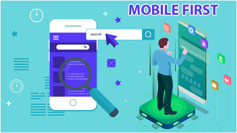
Having a responsive web design has become a priority more than a necessity. It is important as much as SEO and content quality. In 2018 April, Google changed its algorithm for ranking and singled ‘mobile optimization’ as a most important move for the companies to come on the ranking. So it means that if your site is not mobile optimized and has is equal in all the other parameters to your competitors’ website, they will likely to outrank you in their index.
- ‘Say No To Duplicate Content’:
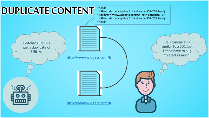
Many companies have been utilizing the desktop version of a website and also a mobile version. This sometimes leads to duplicate content across the web. Always keep in mind that, to Google bots, any distinct URL is considered a unique site. Working by keeping ‘mobile-first’ as a priority will help you to consolidate your content to a single unique URL site.
- Lower Bounce Rate:
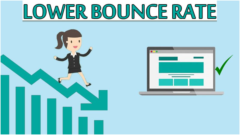
What is the bounce rate? So, when a user comes to your site and if it doesn’t like and goes back to close your site in just a few seconds, this increases the bounce rate. If you wish to hold the users on your website, remember what Google says- treat your customer with a good user experience. And if you have failed to do that it will result in:
- Higher bounce rate
- time spent low on page
- A low number of clicks
- Low number of page views
The quicker users leave your website, the more you will have a higher bounce rate. This is the metric on which Google and other search engines give attention to, the search engines will correlate with how much your content is relevant or irrelevant for customers.
- Page Loading Speed:
So your responsive web design also includes page/website loading speed, and it is a serious thing to consider as well. If your website or a page on it, is taking more than three seconds nearly 50% on your audience will quite your website right away. Another study says that when your website’s performance especially loading speed is low, nearly 79% of visitors get dissatisfied and never want to visit again.
Optimizing page load speed has a well-documented linear impact on the customer’s perceived positive experience on your site. Not only this Google is also very much clear about its algorithm that load speed can give a website high ranking.
- User Experience:
When you consider user experience as your top priority and work accordingly to make it good for them, your website automatically starts performing better. Mobile-friendliness, responsive website, quality content, easy to access and more comes under this, so make sure to concentrate on all of these. Google will recognize the usability of your website by some of the metrics such as time spent on your website. The user-friendly website has more chances to improve its ranking, but it should be done regularly to see the better results of On-page and Off-page SEO.