 Posted by
 If we wish to visit a specific website, it is quite obvious that we are not going to open our laptop especially for that. We all have access to smartphones and that is where we browse the websites.
This was noticed by Google and the concept of ‘mobile first indexing’ was introduced. This means that the mobile version of the website is the starting point for what Google adds in their index. It has also become a factor to determine the rankings.
If you evaluate the crawl bot traffic to the website, you will come across a hike in the traffic via smartphone bots. The cached versions of the page are also going to be the mobile version of the specific webpage.
If the website doesn’t have a mobile version then the desktop version is going to be indexed. However, absence of a mobile version will have a negative impact on the website’s ranking. If the website offers a mobile experience then it is obvious that it is going to be appreciated and will receive a boost in the rankings.
As per Google’s very own latest guidance on mobile first indexing, if you have responsive website design or alike in its desktop and mobile versions, you may not have to do anything in a different way if you are satisfied with your present rankings.
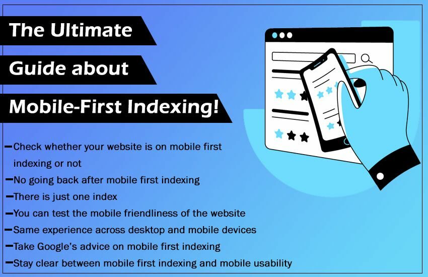
Things You Must Know About Mobile First Indexing
Once you know the key facts related to mobile first indexing, you will have a better understanding of the concept automatically. It will get easier for you to adapt the process and make your website mobile first.
-
Check whether your website is on mobile first indexing or not
If you have already taken the first step towards mobile-first then you might have already seen a Google Search Console notification telling you so regarding the same.
If you have missed this or haven’t come across it or just want confirmation that you are on mobile-first indexing then there is an easy way to check this.
Go to the Search Console and paste your URL for the site by entering it into the textbox that you can find on the top.
-
No going back after mobile first indexing
You should know that once you have opted for mobile first indexing, you can’t go back to the normal ways and opt out of it.
This means that you must keep the guidelines of mobile first model in mind when you design and develop the website if you wish to have a better ranking.
You don’t have to worry about it as you don’t have to make major changes even when you go mobile first.
Google says that “If you have a responsive site or a dynamic serving site where the primary content and markup is equivalent across mobile and desktop, you shouldn’t have to change anything.”
You must have a talk with your developer and designer and ask them to follow all the guidelines when it comes to mobile first indexing. If there is an element that is making the content of your mobile version and desktop version appear to be different then you should work on that too.
Mobile first indexing is going to stay no matter what so if you have not opted for it till now then you must.
-
There is just one index

If you are one of those who think that just because there is mobile indexing then there is desktop indexing too then you are wrong. Google has just 1 index which shows that the crawlers crawl and index your website.
They don’t index the webpages that Google holds. If you have the same content on both the desktop and the mobile version then you won’t have to go out of the way as well.
-
You can test the mobile friendliness of the website

You can search for Google’s mobile friendly test tool and then test your website. Input the URL of the web page and find out the mobile usability issues that might be present.
You should know that mobile-usability and mobile-first indexing is not one and the same thing.
A particular issue to pay attention to is blocked resources. Google explains by mentioning that ‘If a blocked resource is important, it could have a big effect on how Google understands the page. For example, a blocked large image could make a page appear to be mobile-friendly when it is not, or a blocked CSS file could result in incorrect font styles being applied (for example, too small for a device).
This affects both the mobile usability score and Google’s ability to crawl your page. You should ensure that vital resources are not blocked to Googlebot by robots.txt and are generally accessible.’
You can also analyze the mobile usability of the site by visiting the parallel tab under the option of ‘enhancements’ menu in Search Console. You will be able to see any errors that need your immediate attention.
-
Same experience across desktop and mobile devices

Designers and developers pay a great deal of importance to a website’s mobile UX which is highly appreciated.
The issue that might come with this is that they try to hide a number of desktop elements when a page is seen on a mobile device. This is what gives birth to quite a few issues when it comes to mobile first indexing.
Google says that a website should offer the same level of experience across both the desktop as well as the mobile devices that too if we talk about the content.
The Google guidelines state ‘If your mobile site has less content than your desktop site, consider updating your mobile site so that its main content is comparable to your desktop site. Almost all indexing on your site comes from the mobile site.’
If you designer thinks to take the easy road and asks to enhance the mobile usability by taking down the content then don’t allow this. This will take a toll on the traffic of the website and it will be a loss for you.
You should conduct a meeting and tell all the people who work on the website as to why it is important to work on showing content in a user friendly rather than hiding it or taking it down.
It is also one of the reasons why SEO should be unified into the extensive website team within a business and let such points be taken into consideration before it is too late.
Apart from the content, you must take the below mentioned points into consideration as well:
- Structured data
- Meta data
- Meta robots tags
- Ad placement
- Images and videos
It is important that you keep these elements the same across mobile and desktop devices to prevent the problems that could come from mobile-first indexing.
-
Take Google’s advice on mobile first indexing
Google wants to provide best of the experience to the users due to which they lay great emphasis to mobile first indexing. You might not be able to crack all the Google’s algorithms but they literally serve the tips on a platter when it comes to mobile first indexing. You can find it online and it is a great read if you wish to understand the mobile first indexing in depth.
The guide will guide you around the following specifications:
- Making sure that Googlebot have the access to your content
- Ensuring that the content appears to be same on desktop and mobile
- Checking the structured data
- Putting the same metadata on both the website versions
- Checking the placement of the ads
- Checking graphic content
- Added best practices for separate URLs
- Troubleshooting mobile-first problems
-
Stay clear between mobile first indexing and mobile usability

You should be clear about the fact that mobile usability and mobile first indexing are two different concepts. To quote Google’s John Mueller-
‘A site can or cannot be usable from a mobile point of view, but it can still contain all of the content that we need for mobile-first indexing.
An extreme example, if you take something like a PDF file, then on mobile, that would be terrible to navigate. The links will be hard to click; the text will be hard to read. But all of the text is still there, and we could perfectly index that with mobile-first indexing.’
This means that the smartphone Googlebot can and will crawl the pages that are not thought to be mobile-friendly. But that doesn’t mean that the mobile usability of a page doesn’t influence the mobile rankings of the website.
If you offer a meager experience, hide content or your site has other mobile issues, these are all things that could affect your page’s ability to rank.
Concentrate your efforts on serving the best possible experience for your site users, while accounting for the things that we know Google is taking into account with mobile-first indexing and you shouldn’t run into some problems.
We hope that we were able to provide you better clarity on the concept of mobile first indexing. If there is anything else that you would like to know then you can get in touch with us.