 Posted by
 What is the major difference between the mobile-first website design and responsive website design? Which approach is the best for your business? The responsive design begins on the desktop that needs maximum resolutions and scales down to the minimum screen. Although the content and layout deal to match smartphones, content, navigation, and downloading speeds have designed for your traditional website. Responsive web design services help you for a responsive website. Mobile first design is same to design a mobile app and adjusting the layout which can be observed smartly on the desktop and tablet devices without too several modifications. Your entire design and layout depend upon offering amazing mobile user-experience, quick downloading speeds, and rich media content to keep your target audience interested, and easy touch screen navigation and so on.
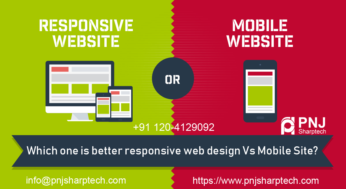
A Deep Discussion over Responsive Web design Vs Mobile Site
Why Responsive Design?
Responsive design is common among B2B businesses where the website content must be authoritative and informative. Rich HTML content structured rightly is also great for search engine optimization. Responsive web design permits you to have a single website that matches the screen size of the device on which it is being observed.
The Pros-
- A single website- It is very simple to administer just one website for all types of devices.
- A single URL-It check that your users will find out you on mobile devices without waiting for redirects, even on slower connections.
- Easy SEO- There is no necessity to create particular content for mobile devices when you still enjoy the advantages of your desktop website SEO on mobile devices.
- Easy Marketing- No additional work for the marketing department needs to promote your site on the mobile.
- Low Cost- Easy Math- One Website is very affordable than two.
The Cons-
- A single website- Having one website for all devices may be very easy for you, but not for your users. You will put different emphasis on a similar page in order to maximize conversions using the benefits of the platform.
- Technical- As responsive web design is the latest technology, there are some outdated devices with old browsers that will load the site too slow or even not completely.
- User Experience- Mobile is a totally different experience than desktop. So having a single, even responsive website may damage your overall UX on both platforms. If you want to satisfy both desktop and mobile users with a similar user interface, you may finish up satisfying no one.
Why a Mobile Website?
A mobile website is designed in such ways for mobile devices keeping all the limitations and opportunities of the platform. When creating a mobile website, you must keep some important factors such as small screen size, interaction processes (touch), and limited connection speed (2G/3G). Content should be easily accessible, readable, and fast-loading.
The Pros-
User Experience-
A website specifically optimized for mobile devices along with the benefits and limitations of the platform. Therefore you have the right ground to build an attractive and functional UX.
Speed- Your website will load quickly and simply on mobile platforms.
Cost- Creating a mobile website is not an affordable option as compared to responsive web design, but still, you can obtain a very reasonable rate for the value.
Benefit From Local Search-
Search engines tend to offer better UX, hence in the local search results, mobile-optimized websites have better opportunities to rank.
Instantly Accessible-
A mobile website is easily accessible anytime from anywhere. It takes a few seconds to download.
The Cons-
Multiple URLs-
You clients have a minimum of two URLs. The mobile website will require extra SEO work.
Maintenance- You need to maintain two websites.
Not Commonly Compatible-
You should consider that there are 2 different kinds of mobile devices such as touch screen and keyboard navigation. A single mobile website will not work in a similar way across all device types.
Which Platform is the best for your business?
To answer this question, you must consider your business objectives. You may select a responsive website for tablets and desktop or a mobile website for mobile devices as per your business needs and goals. This depends upon the scale of your business and budget, you are willing to assign for the project. Plus, responsive web design services offered by a leading company can help you to choose the best ones in the right ways.
Conclusion- Which one is better responsive web design Vs Mobile Site? This is a very important question for all types of businesses. You can choose the website as per your business needs and goals. It depends upon the scale of your business and budget.