 Web Design is an industry where things are always changing. In what seems like the blink of an eye, brand-new parts and patterns are continuously added.
But if these parts are carefully and strategically brought to one place, your business may perform totally differently than actual. If you do things right, you might be able to tell a good story to your audience.
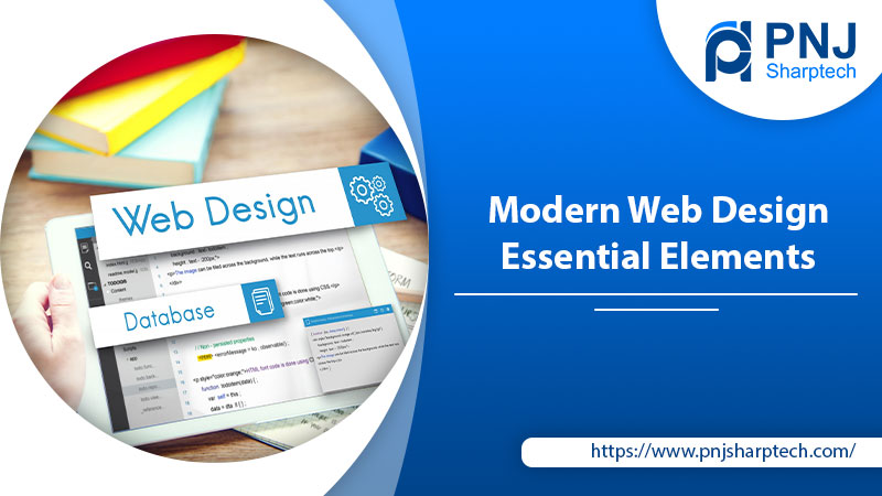
Essential Elements For Web Design
1- Minimal Design
Getting a minimalist look is not as easy as it seems. It’s easy to use and doesn’t have a lot of extra stuff. Studiorotate.com and MikiyaKobayashi.com are two websites that come to mind as great examples of Web Design done very well.
The main idea behind minimalism is that you should focus on only one part of your website that you want people to remember, so that part should be the most noticeable thing on the landing page of your website.
2- Micro-interactions are very helpful and considerable
Most of the time, you won’t even realize that you have micro-interacted with something, like an interface or Web Design. When you woke up, did it occur to you that you’d already turned off the alarm? In order to put it another way, this is kind of like a small interaction. And you liked the picture of myself that I put on Facebook. Again, this is an example of micro-interaction. And this we can see in a lot of the devices and apps that people use today.
Micro-interactions are an important part of every Web Design project. Almost every website and app requires users to interact with the service in some way. Whether it’s a progress report or a quick response to an action. This could be a progress report or some other kind of response. An obvious need to do something
3- There are Videos in the Background
Websites for both big and small businesses can benefit from a video background that fills the whole screen. This is a great chance to show off your business’s goals by putting them front and center on your site’s landing page. Also, start-ups could be a great way to turn the idea into a reality.
People who don’t know much about computers will be more likely to visit your website if it’s easy to get around. In this day and age, it may be hard to believe that a market like this still exists, but it does. And on a website, easier navigation makes it more likely that people will come back often because they know how to get around and won’t get lost when looking for the things they came to the website to find in the first place.
5- Social Media Integration
every page that is online right now. When making a plan for how to use social media, you can think about both your company’s brand and the products it sells. Visual media like Snapchat and Instagram could be helpful if you’re trying to sell fashionable or glamorous products. There are a lot of tools that can help you integrate social media in a cool way. And which can make your Web Design in its most basic form more organized and beautiful.
6- Using things that come from nature
When flaws are put into a design on purpose, that Web Design becomes a work of art. Correct, man-made shapes were once acceptable, but those days are gone. Accepting that things aren’t perfect is a big part of modern culture. It’s this acceptance that gives websites their own unique look.
7- The SVG format for graphics
Scalable Vector Graphics, which are also called SVG graphics, are the main tools that a designer uses today. They make it possible for a website to do much more than it could ever do on its own. With these pictures, the site really comes to life.
Waaark.com is an excellent example of a site that uses SVG a lot and is a great example of this. This website is full of SVG in every way possible, and the whole thing is so interesting that no one would want to leave even if they wanted to.
8- Convertible content
The design has changed in the same way that other fields have. The strategy that combines design and content is becoming more important to the way that more and more internet companies run their businesses. The amount of content that can be changed into different formats is growing. Using websites like Slideshare and Piktographics, you can turn your content into the form of a presentation slide or an infographic. Not only that but the people who make your content cover a wide range of other formats that you can choose from. Storytelling has become an art form in recent years, and this trend is likely to keep going up like a rocket.
9- The product was shown personally to the people
Over the past few years, one of the things that have changed the most is how landing pages are laid out. The most recent change in this industry is that landing pages now include live product samples. The movie shows how a digital tour of the whole product works. It is found that Slack has secretly adopted this, and as a result, the vector graphics that cover the Slack interface look amazing.
10- Use the rule of three-thirds
Composition is an important thing to think about when making a website. It helps build the structure of the way your website looks. If your website as a whole is a mess, even the best font, hero photos, user interface, and user experience design won’t save it. Rule of Thirds, also called the Heavenly Rule of Photography, is based on the idea that photos or text should be placed on a website so that they are in the middle of the four points where the six lines of the grid meet. It is usually lined up with either the two focal points on the left or the two on the right.
11- Significant focus on user experience design
Everyone agrees that the user experience, often known as UX, is the single most critical factor. When we go back five years, user experience (UX) was hardly unknown. It is now much simpler to make Web Design and UX function together like other aspects of a website, thanks to resources like free UX eBooks and UX stack exchange. The end result was a delightful interaction for the user.
12- Card configurations
Most people say that Pinterest was the main reason for its initial rise in popularity. Since then, nothing has been able to stop them. Using JQuery and Masonry, it wouldn’t be hard to copy the way the cards are set up. The card layout provides assistance to serve a Web Design that has a lot of information on it. Card layouts are already very popular on websites. Popular sites like The Next Web and UGSMAG already show this trend.
13- Extra-large product images
Your product has some features that make it stand out. Why not tell people about them and get their attention? With this simple logic, it’s easy to see why so many B2B companies now have big photos of their products on their websites. Not only do these pictures move, but they are also easy to read and can be done quickly. This gets the visitor’s attention right away, and the pictures help him understand the product better.
14- Pictures of Huge Things
The key to running a website well is to have things that are easy to tell apart. Because of this, Genesis.com’s website is mostly taken up by a big picture of one of its products. Also, if you look closely, you’ll see that the Rule of Thirds and negative space are used consistently and very well to make the difference in color between the car and the background stand out. This was done to show how different the two were from each other.
15- Using a small number of colors that are still strong
When it comes to making general enhancements to the aesthetic appeal of a website, the colors that are picked may have a big influence on the website’s overall appearance. After all, it is what ultimately contributes to Web Design‘s more polished overall appearance generally. If you want your website to have a professional look, you will need to put in a lot of effort to study how colors work and to predict how they will interact with each other. This is necessary if you want your website to have a professional appearance.
16- An obvious need to do something
It is important to have a call to action if you want people to involve. If you want the user to interact with you as much as possible, you should focus on the button. Don’t hide the button too much with too much design. The main focus of the minimization strategy is making sure the call-to-action icon is there and that there is enough white space.
The goal of all the Web Design work that went into your website is the call-to-action icon. If the user was impressed enough by the way the website was laid out, they will click the button to go to the next page if it is there. This is your only chance to make people interested. Make sure you don’t miss out on this chance.
17- Make sure that your website is set up for search engines
You can only make money from what you do online if you take the time to make it easy for search engines to find. If search engines can’t find your website, all of your efforts to make it look good will be for nothing as far as making money goes. Search engine optimization (SEO) is nothing more than a list of rules that a website must follow.
The main goal of search engine optimization (SEO) is to make users happier with the websites they visit as a whole. Search engine optimization standards are based on how friendly a site is to users (SEO). A good SEO strategy includes adding Meta descriptions, title tags, header tags, and other tags.
18- A design that encourages speed
A recent report says that a user will decide what they think about your website in less than 0.05 seconds after the page loads. The consulting firm’s report that 47% of users expect a web page to load in less than two seconds adds fuel to the fire.
You need to know that the average person who looks at your content on the Web doesn’t stay interested for more than a few seconds. You only have this much time left to impress your audience. If your website takes that long to load, that just can’t happen. You need to devise a plan to get your website to load faster than it takes to blink.
19- Custom Digital Illustrations
Nike has done a great job of making unique Web Designs. They have made weird animatronics to stay true to their beliefs and the level of comfort their products offer. By doing this, they have used all of their creative abilities to the fullest. Just look at this and decide for yourself. On this website, the Hamburger Menu is available and it’s used in a great way.
20- Short videos about features or products
In order to make Web Design more fascinating, include a little video in which someone discusses the product or service that is being sold. In point of fact, the website Watson. la serves as an excellent illustration of this general idea. They make effective use of white space, short films, hero photographs, and colors that contrast brilliantly in such a wonderful way that it is difficult to keep your eyes off the numerous intriguing elements that the website offers.