Website designing is no cake walk, it requires ample amount of research to come up with a design which is impossible to miss.
It is very important to have a proper plan before starting out the process of website designing. Make sure you are very clear when it comes to what the client wants to communicate via design. If the initial discussion is not insightful then the design might not be up to the mark.
This is your ultimate cheat sheet to create a website design which goes down pretty well with the users and makes them invest their time in your website.
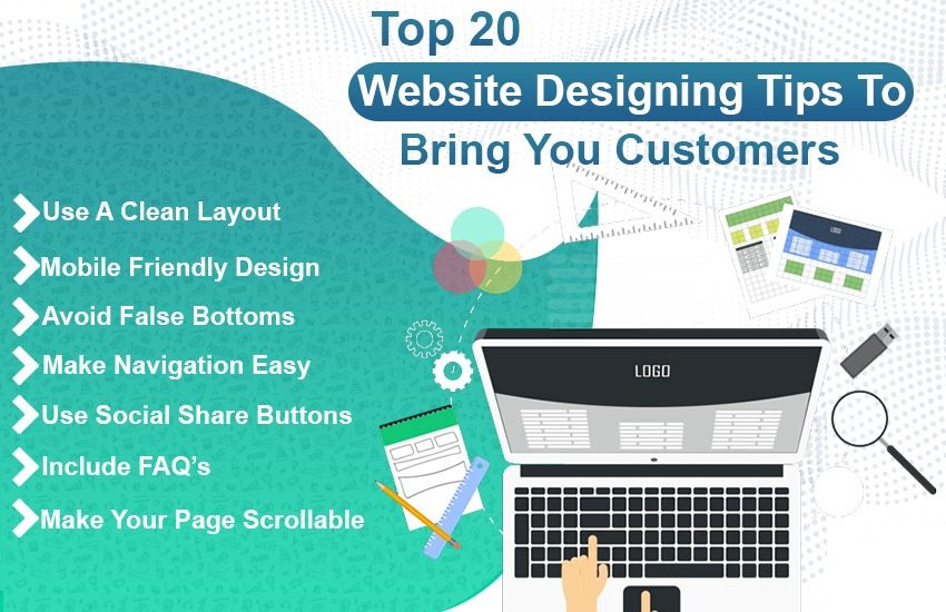
Keep the following top 20 website design tips in mind if you want a high success rate-
1. Use A Clean Layout
Some designers often commit the mistake of making their website way too cluttered in an attempt of making it different and creative. When it comes to selecting a theme, make sure it is not too complicated. You want your users to understand your website and not stay confused. Always pick a clean layout which is easy to understand and pretty self-explanatory. As a designer, you must think of a website from the user’s point of view while selecting a layout.
2. Use White Spaces In Your Favor
White space is the blank space between graphics, images, texts, margins and any other elements on the website. It is also known as negative space. Contrary to its name, it can do wonders if used effectively. Not so negative now, right?
You can use the white space to come up with a design which is not too distracting and has a user’s attention exactly where you want it.
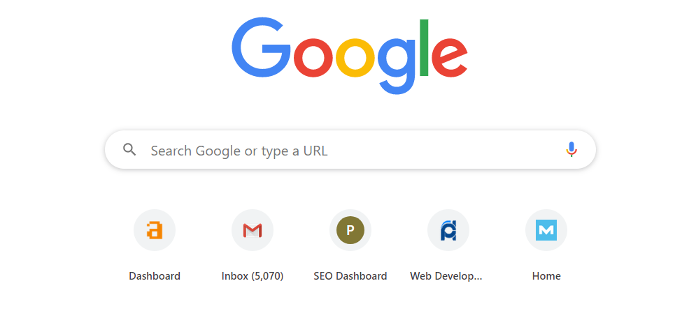
Best example of perfect use of white space is ‘Google’.
You can also use it to structure your content. The amount of white space between your content acts as a visual hint which shows visitors the relationship between different elements. It can be clustered together by decreasing the white space between them or divided by increasing it as per the convenience.
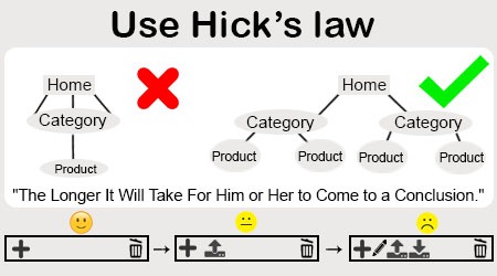
3. Use Hick’s Law
It is a proven fact that more the choices a client has, more will be the confusion. This makes our Hick’s law Hick’s law which states that the more options are presented to a person, the longer it will take for him or her to come to a conclusion about which option is the best.
Therefore, it is suggested to categorize and limit the choices offered to a client so that it actually leads in conversion.
If there are complex options in your mobile app or website which could overwhelm your users then just hide them for edge cases and power users.
However, there is a disagreement about whether or not hiding rarely used options is good or bad drill but there are techniques in UX design which helps you to hide options and let power users know that they can find information as well so it is a win-win situation.
4. Proper Placement Of Call To Action Button
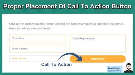
Usually, designers put CTA button on every page possible which will never fetch you good results. Not all pages on your website require an action to be taken and if it does, you might want to reconsider them. It is always suggested to have a CTA at the bottom and not on the top. This is because you first need to tell your client the base of taking an action and not just ask them to act without providing them any information. If someone asks you to fill a form without telling you what is it for, will you fill it? No right. Likewise, the user will not be confortable even if it is just sharing their mail ID till they know why you are asking for it.
5. Keep The Content Simple
You might have writers who graduated from Harvard University who probably knows 10 fancy synonyms to the word synonym itself but always remember to keep your audience in mind. Don’t write something which requires your audience to sit with a dictionary while visiting your website. It is best to keep the content simple so that your users won’t have a hard time in understanding what you want to say. Don’t make your content look like some encrypted texts which requires the assistance from a professional to decode. You might want to sound highly intellectual by using big words at unnecessary places but you might just look like you are trying too hard to impress which will put off the readers. Therefore, play safe by using layman’s language.
Let’s say you have content on your website which makes your reader think, ‘Oh it is so relatable, my best friend will have a good laugh by reading this’ but there is no easy way to share it. Not everyone will go through the trouble of copying the URL and sending it to their contacts. This is where social share buttons come into action. They help the user to share the content on their timelines or with someone at the click of a button, quite literally. You could be missing out on a lot of traffic if social share buttons are not a part of your website. They have the power to multiply the reach and attract more traffic. Also social media optimization effects the Google ranking of websites.
7. Vital Use Of Images
If you have just content and no images then sorry to say, but your content is boring even if it is an exceptional piece of work. Make sure you use images wherever possible to keep your audience interested. Create a visual representation of the text so that your audience is able to understand what you are trying to say in a much better way. Also, you should optimize images for better search engine results.
It is also suggested to use images of real people rather than illustrations at apt places as they are far more relatable. Don’t use the obvious stock images as it might give out a fake or a superficial image of your website.
8. Effective Typography
How would you feel if you read a line with super fancy font, weird size and extremely light color with a light background? I’m guessing you won’t stick for too long and trust me, you shouldn’t. Reading something shouldn’t be a task; it should just go with the flow and be effortless. That is why effective typography is very important. Make sure the text size is readable, the font is understandable and it complements the background. The typography also has a strong say when it comes to determining what the brand wants to communicate. Please note that typography works best when it’s balanced. Use different sets for headers, sub headers and body text but make it a point to stay stable with these sets throughout the site.
No one likes a bumpy road with unexpected turns and sudden speed breakers. In the same way, no one likes a website which is tough to navigate. Everyone has their own techniques for finding their way around a website. A good web design provides its navigation to its audience so that it feels spontaneous because lesser the users have to think about it, the better it is. Make sure your users have a pleasant experience on your website by providing them seamless navigation. Always categorize your page in the most suitable manner and don’t experiment too much and mess the whole website.
10. Keep On Updating
No one likes to visit the same website and find the same old content. The users are on the lookout of something new and not to forget, change is the only constant. Make sure you update your website so that there is something new for the user and it gives them a reason to stick around.
11. Descriptive Headlines
Don’t use too complicated headers. Your headline must have the ability to give out an idea as to what the content is going to be therefore keep it as straight as possible and there is no use of beating around the bush just because you want to sound cool. Rather than writing a flashy headline, write something descriptive which is easy to understand and has a connection to your content.
12. Avoid Carousels
This might surprise you but please don’t use carousels or sliders. They do have the potential to provide a lot of information at once but the reality is that no one even clicks past one slide because in the end, it is a website and not a PowerPoint presentation. Most of the times, people don’t even notice that there is a carousel so what is even the point of having it, right?
They are very distracting because a user wants the freedom to explore the website at their own convenience and don’t want a slider to guide them and restrict their experience in any possible manner.
13. Use Faces As Visual Cues
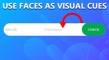
It is advised to have a person’s image facing towards the specific part of the content where you want them to focus. By taking your photography skills up a notch, you can significantly improve the quality and performance of your website designs. Instead of using a photo showing a person gazing straight ahead at the user, try a picture showing a person eyeing subtly toward your call to action. These kinds of smart photo combinations could possibly boost your conversion rates.
14. Apt Color Scheme
Colors play a vital role when it comes to website designs. A color scheme has the potential to make or break your website so always use them wisely.
Every color has the ability to induce different emotions in the visitors. If your brand identity is calm and smooth, a blue would fit better than a blazing hot red. Apart from picking the best colors to represent your brand, you also need to use them well like distinct colors to establish visual hierarchy. Once you have an established color palette then make sure stick with it. Keep your primary, secondary and background colors consistent throughout your entire site in order to strike a balance. Also, please don’t play favorites. Let’s say your product is ecofriendly but your favorite color is royal blue then please don’t take a detour and stick with shades of green because of the relevancy.
15. Include FAQ’s
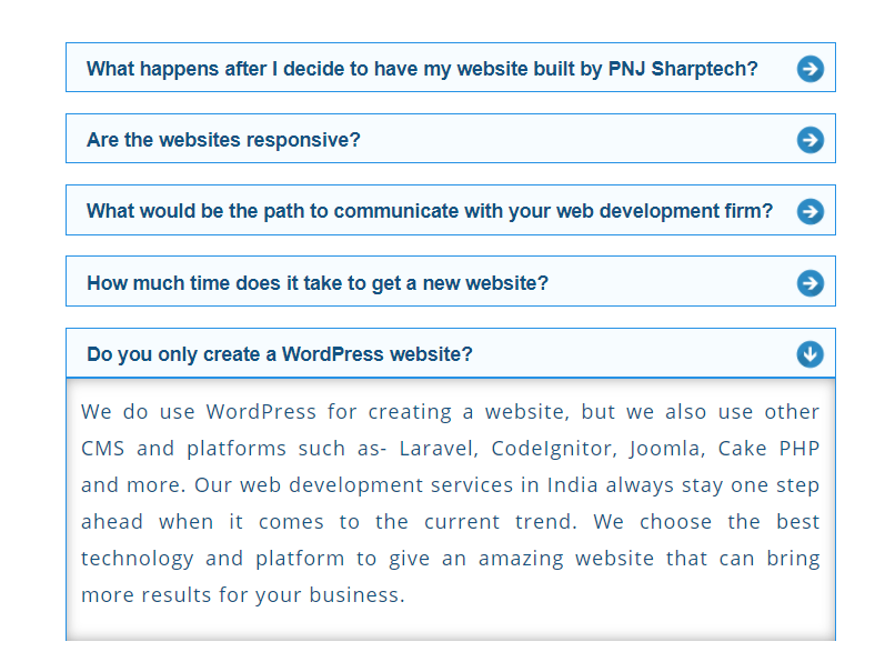
Keep your website’s design in such a way that it can naturally house FAQ’s. They are frequently asked questions and by answering them, you can really prove to be helpful to your audience. Inculcate this page in your design and thank us later because it will surely boost organic traffic on your website. Who doesn’t like all the answers at one place anyway!
16. Mobile Friendly Design

Most of the searches are done via mobile phones therefore you must keep the design in a way which makes the website appear on the phone like it would on the desktop. Ensure that the text and images are intact and the formatting doesn’t go down the drain when accessed on the mobile phone. It should be highly optimized and use plugins to test the website on different devices as well. If the user is accessing the website on their IPhone or android phone, it must look the same without any glitches. Not to mention, it is a ranking factor as well so make sure you test that the design is mobile friendly before you roll out a full version.
17. Logo On The Left
This is just a basic tip which holds a great deal of importance. It is suggested to place the logo on the left side of your website so that it doesn’t get too distracting for the users but its present as well.
18. Avoid false bottoms
When you give a single section a dark background then your audience will automatically assume that it is footer. This identifies as false bottom which a web designer must avoid at all cost. If the users come across a false bottom, they will think that it is a footer (which means end of the page) and will stop exploring your website and might exit it too. Therefore, avoid giving out the idea of false bottoms to keep your audience engaged.
19. Stick With The Standards
Good web design flourishes on basic standards that are there because of the established fact that they work. The more twisted a site becomes, the less appealing it is to the audience. Weird and unusual layouts frustrate the users as the user probably will have no idea how to interact with your website design. Make standards function to your advantage and design creatively within that space, rather than attempting to come up with something clever and fail.
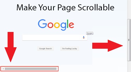
20. Make Your Page Scrollable
Last but not the least; blend this tip to offer a seamless design. You will need a lot of space if you have a lot of information to share with the users without making the design look abrupt. You can present the details in a scrolling page which will work in your favor as it will keep the user going with the flow.
To back it up with a fact, there have been studies that display that conversion rates surge by up to 30% when there is more data to scroll on a webpage.
Try using these above mentioned website design tips to not only increase the traffic but to enhance user experience as well. Always remember, loads of information alone won’t do well if it is not pretty to look at so invest your time in web designing and enjoy the sweet fruit later!